That's what your magic cards are going to look like in the forseeable future.
just for Michael.
Anyways the new card design was presented by Aaron Forsythe on the mothership. Here are the things he listed as being new:
- The font
- The holofoil stamp
- The collector info
- Decreased border size
- The designer credit
Let's go through them in that order. First up, the font is basically a few minor tweaks on what they were already using. The best thing about the font is the name, "Beleren". Lol. While we haven't seen every character in the font I am a little worried and it's all because of the "F".

Dear god the "F" is horrible. Seriously, how can they not see that?
The holofoil stamp. Stupid, I don't give a shit.
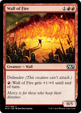
The collector info. This is a huge improvement. Just take a look

Please excuse the low res. I don't know about you but I had the hardest time reading the collector's number on the cards. In particular when it was white on black as seen above. Now we should be able to read that super easy.
The downside on this one is that the bottom of every card is now black and they totally screwed up how the flame goes from red to black. The rules text box is now just elbowing the shit out of the border. Gross.
The decreased border size is awesome. The border exists to make the printing easier and I'm pretty sure we're lasers are involved somewhere in the printing process. It frees up some extra room especially to make the text box bigger. Which is great.
The designer credit. It's hard for me to see that as anything but them masturbating. We shall see.
Overall I think these changes are ok. We really need to move those mana costs to the upper left though. Future sight style.
No comments:
Post a Comment